
Lifelong Learning Centre Branding,
UI Design
Lifelong Learning Centre is a daycare that needed an identity for its business.
Role
Brand Consultant
I worked as a Brand Consultant tasked with creating the brand identity for their business. This started with research, competitive analysis and strategy for creating the user interface design.
Design Process
The design process that was followed to find the right opportunity and design the best brand identity for Lifelong Learning Centre that is memorable and conveys the brand mission and values.

Style Guide
Inspired by the mood boards, I created the style guide values that I wanted to communicate. I decided to go with a minimalist look with simple lines for icons.
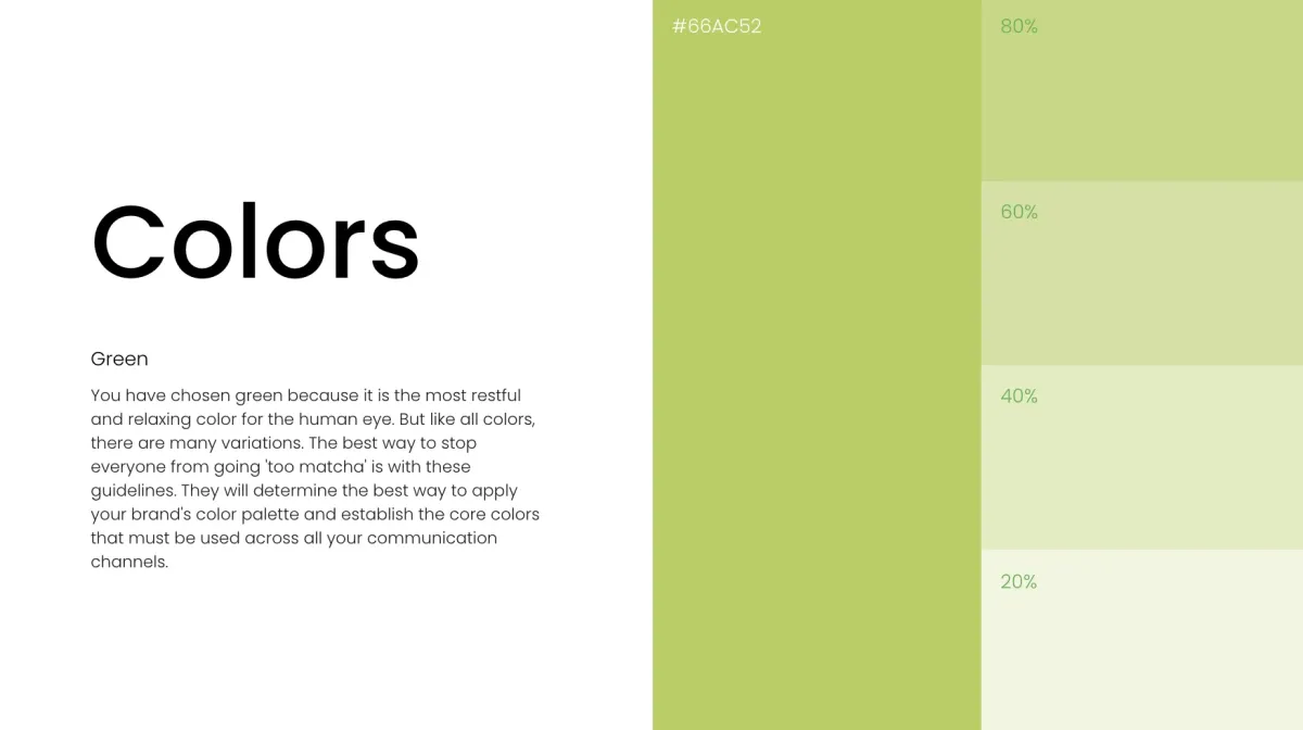
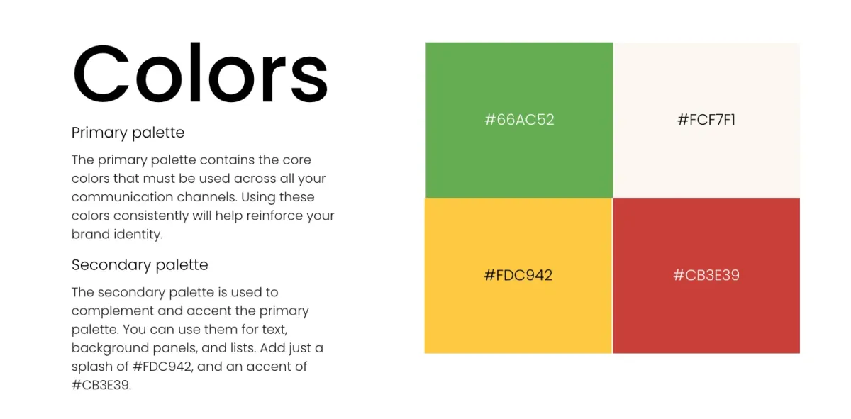
Colors
I chose fun colors to bring forth a sense of happiness and fun.
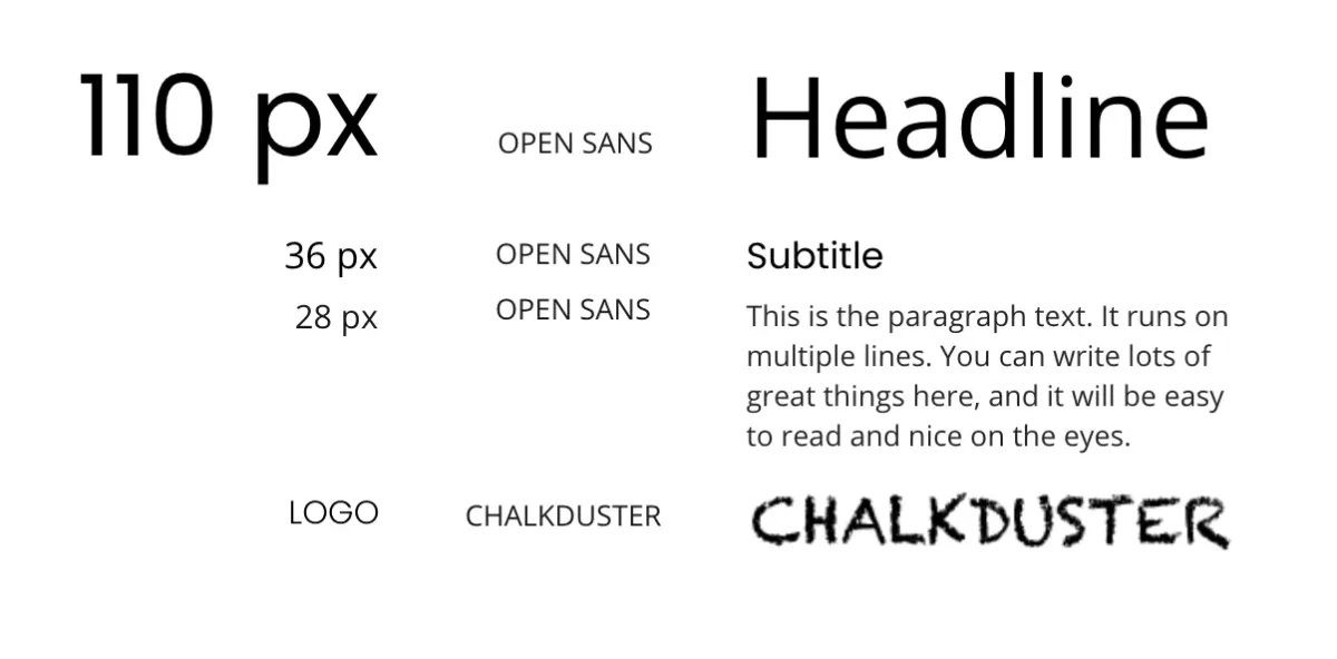
Typography
After conducting some research I decided to use Open Sans for the body text because it nicely complemented the overall sense of professionalism while it’s fun in its look and feels. It’s also easy to read for a better user experience. I also used Chalkduster for the logo because it gave it a handwritten feel.
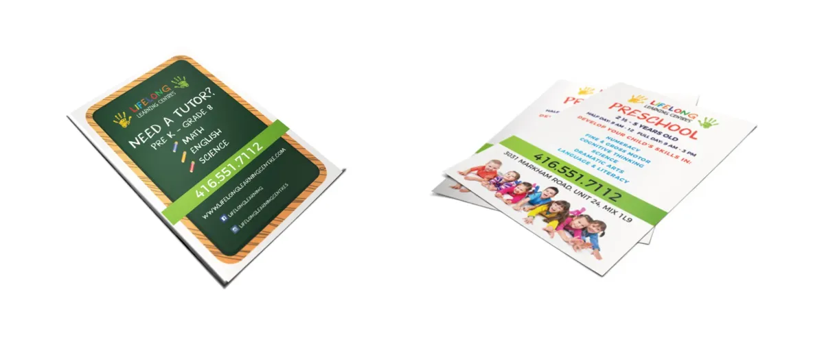
Photos
Clarity
Clutter-free images read better than a mess of imagery. For example, when in a crowd, prioritize single-subject focus rather than capturing the entire crowd/space.
Naturalism
Avoid stagey photos where people look uncomfortable or the situations seem unreal. Also, be careful not to crop their heads off like in the image to your right.

Perfect lighting
The further you move the light away from your subjects, the harsher the light becomes. When photographing inside, shift your lamps closer to your subject to soften the light on their face.

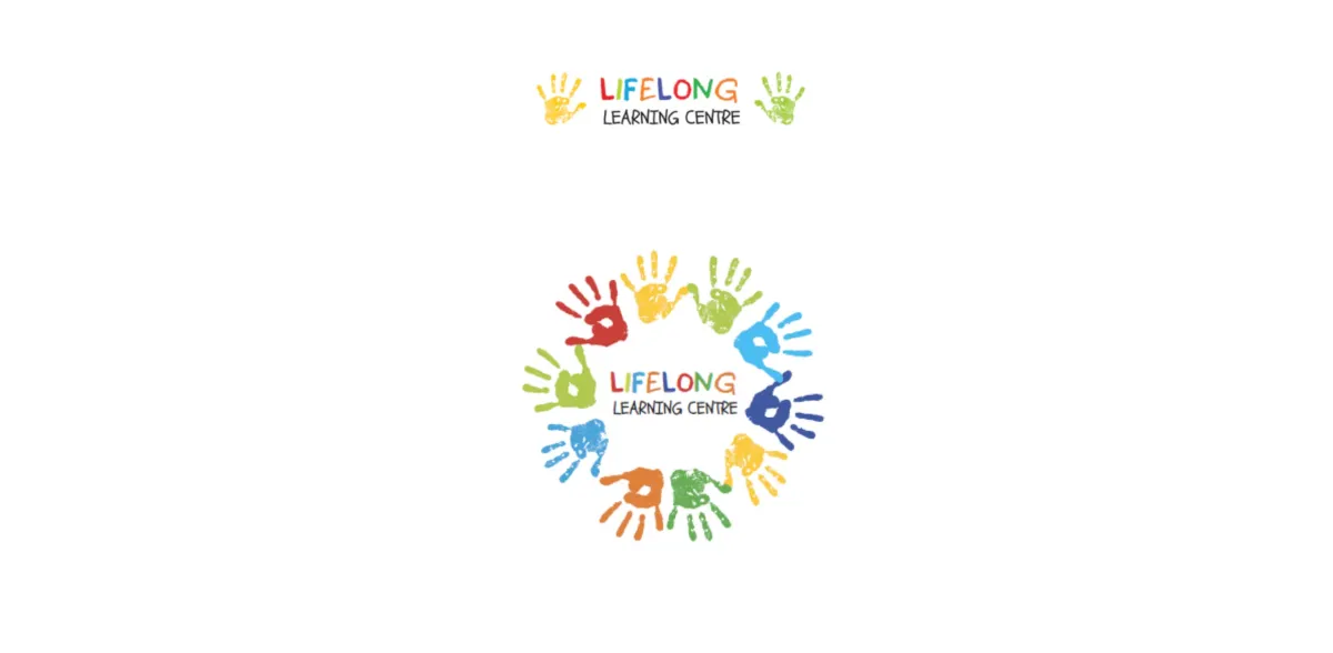
Logo Design
I explored a few options for the website logo and decided to keep it fun and simple
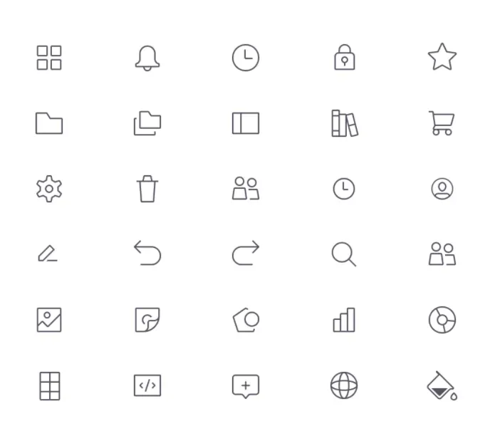
Iconography
Iconography applies to all icons and symbols that may appear on your website and throughout your marketing.


Testimonials
Unleash Your Business Brilliance.
Drive growth through thoughtful product design and strategic vision.
Copyright © 2025 - All Rights Reserved